
The book is an eye opener when it comes to colours. I always loved colours and had an innate way of combining them, so I know what I like and what looks good on me. Probably a lot of people have this sense to a lesser or higher extend. One might also have heard that it is not too smart to paint a bedroom in red, at least if one wants to do some sleeping there, and that blue is a majestic cool colour. But normally our knowledge ends there.
Patti Bellantoni, a teacher at the Los Angeles Conservatory of the American Film Institute, used her classes to go deep down the psychology of colours, how they can be and are used in movies and what they mean to us on a subconscious level.
The book is not about the history of colour e.g., how were colours made in the past, why were certain colours only allowed to certain social classes or why it was so expensive to make colours. When reading a few of those books, in the false hope to learn something about the effect of colours, I must confess I noted I don’t really care how colours are made. A quick amazon recherche made clear that there are still only very few books outside there that explore the deeper psychology of colours on us humans. Attracted, I ordered another one that seemed to be in the same league as Bellantoni’s – it wasn’t. Kitchen psychology about colours is not helpful at all (eg: if you love green, take a closer look at your social life – honestly…)
Patti Bellantoni started colour experiments with her classes many years ago and repeated them every year, getting a profound database on how humans react to colours. She basically told students on a “red” day to bring everything along that – in their opinion – was red and meant “red”. They brought everything from red clothes to red lights, but also things like rock ‘n roll music, salsa and jalapenos. Jalapenos may be green in nature, but when you bite in one it doesn’t feel green, it feels red hot. At the same time, on a red day, the atmosphere was charged and aggressive.
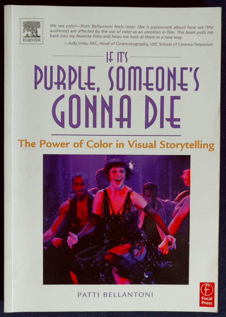
It was a completely different picture on a purple day. She writes of a mystic atmosphere, spiritual discussions and altars or tombstones being built in class. In the movies, as the title reveals, often purple is used to make the viewer visual ready for someone to die. That’s the case in her book cover picture from the movie “Chicago”, where people are being murdered all the time as backdrop of a lively nightclub atmosphere. Purple gives gravity to the scenes and also gives a hint on a second level here, far away from singing and dancing. Watching the movie, I got the impression the producer used colour like from the textbook, but pretty heavy handed.
When you know what to look for, take your time and watch the old classics “Snow White” and “Sleeping Beauty”, made by the Disney studios many years ago. The evil queen wears purple, as does Maleficent, giving her majesty and increasing the danger one feels when seeing her. There is purple all around those two. Snow White herself wears yellow and blue, a combination showing peace and friendliness and also harmlessness. It is a wonderful example of classic colour use in a movie. Going one step further, check out the “Maleficent” movie with Angelina Jolie. There the lady is not really bad, but had been betrayed and is rightfully angry. In the beginning, before she was betrayed, she wore brown green earth tones and later not purple but black clothes. Black can mean many things. Those colours give her less distance to the humans around her and do not make her stand out and marked as someone to avoid because of mortal danger and a vicious personality.
Blue shows cool detachment without being dangerous like purple. Blue signals there is no need for action, no need to communicate. It is a very grown-up colour, a colour for adults. There is a lot of independence attached to blue. One negative side Patti Bellantoni mentions is its passiveness. Blue lets life happen without a fight.
Another colour I’d like to have a closer look at here is orange. It is a wonderfully ambivalent colour. The colour of Vitamin C, oranges, mandarins, the beautiful sunset etc. This is the notion most people have of orange; it is a colour that makes itself obvious without being intrusive. In general, we think orange is healthy and friendly and kind and shining! Patti Bellantoni does give examples of the colour being toxic e.g., when polluted air is shown in movies as orange. There are also various examples of movies, like the “Godfather” or “Apocalypse Now” where orange does somehow give the feeling of danger. I wonder why orange is not more often seen as such a dangerous colour.
Beautiful but dangerous, like the fur of a tiger. Tigers are so majestic and sure of themselves; one would like to stroke them like cats– but the beauty comes with long teeth and sharp claws. They are the largest land predators and take what they want. Orange is obvious, even here. We understand it without thinking about it. Orange is a colour that does not invite deep thinking. It is simply there and has an immediate effect.
I decided to use a picture for this post that I made some years ago in China. The roofs of the palaces in Beijing are in all the colours that stand for harmony. The lush green in between the buildings normally would also give a healthy feeling. Still, I think the shade of green here is the one that has a toxic, poisonous undercurrent (like the poison used on the apple in “Snow White”). I wonder why, I remember the day being scathing hot, but apart from that everything was peaceful. Maybe it was just an invisible memory of what happened on these palace grounds over the years that became a little bit visible through the colours in my photo.
Over the years Patti Bellantoni found repeating patterns for all colours. There are smells that are felt to be red or blue or yellow or orange. I am very drawn to this, because when you read my other posts on scents, you know that I attach a colour to each scent that I see when I smell the perfume.
Whilst colours do have sometimes different meanings in different cultures, she also found out that people with backgrounds from all over the world always painted the state of mind “tranquility” with a horizontal streak of the paintbrush, and whenever somebody painted “anger”, there was some red in the picture.
It seems she did not make further studies on this – I looked very hopefully on amazon if there is a follow up book to be found, but was disappointed. Her wonderful first book stayed the only one – still the best one on colours, their meaning and their effect on people that I know.
Let me end this post with a direct quote from Patti Bellantoni on page xxvii in her book. It is something close to an executive summary: “There are times when I hear a filmmaker say, ‘color can be whatever you want it to be.’ My experience tells me this is a dangerous misconception… I am convinced, whether we want it or not, that it is color that can determine how we think and what we feel.”
She is damn right. Colours are mighty and only with knowledge can we use them as tools. We need to understand that the colours we use with the intention to influence others e.g., through the choice of colours we wear, at the same time influences us. Simply because we see them and the message is directly transported to the brain. When one wears red to look strong, at best the red gives strength back to the wearer.
All rights to the book belong to:
Bellantoni, Patti: It it’s purple, someone’s gonna die, The power of Color in Visual Storytelling, 2005, published by Focal Press, an imprint by Elsevier, 30 Corporate Drive, Suite 400, Burlington, MA, USA and Linacre House, Jordan Hill, Oxford OX2 8DP, UK. ISBN 13: 978-0-240-80688-4